Designing Effective Online Courses

Based on a 2023 survey by the Canadian Digital Learning Research Association (CDLRA), 80 per cent of respondents expect their universities to offer more courses partially online by 2025, and 69 per cent expect more courses fully online.
It’s easy to think that online courses are simple to put together. After all, you just need to compile your content and assessment, and put them in the course, right?
Not quite.
So, what makes a good online course?
For starters, a good online course:
- Achieves your goals and your students’ learning goals.
- Has a balance between including all your content, yet not appearing too complex.
- Looks good and provides a positive user experience (UX).
Spending time on the theming and layout of your course can add a huge amount of value to your site and help with student engagement.
Catalyst IT’s e-Learning consultants work with a large number of educators and LMS administrators to help them achieve their learning goals. Leveraging Moodle LMS’s scalability and high performance, here are a number of common things to look out for when designing your online course.
The number one pitfall to avoid
The most common mistake most people make when putting together a course is thinking about content first, rather than layout.
Focusing on adding content first can create a long line of items that is commonly knows as the ‘scroll of death’; the information is hard to read and retain, resulting in the users losing interest in what is written. While scrolling works really well for sites like Instagram and Pinterest, where browsing is the main aim, a course works differently. A long page of items, with no breaks or memorable design, isn’t going to help a student find where they are or help them find an item they saw two weeks ago, that they want to refer to for their assessment. A course shouldn’t leave a student feeling annoyed or helpless. The course should be succinct and easy to navigate, providing students with a positive experience where they feel empowered.
Lessons to learn from
Most of your students are familiar with the internet, so use that to your advantage. Think about sites that you like, and more importantly, those that you don’t.
Too much content
Websites that are filled with too much content, such as multiple videos, images and links can be overwhelming and distracting to a user. This means they’ll most likely have difficulty processing what they see. Additionally, it can slow the speed of the site.
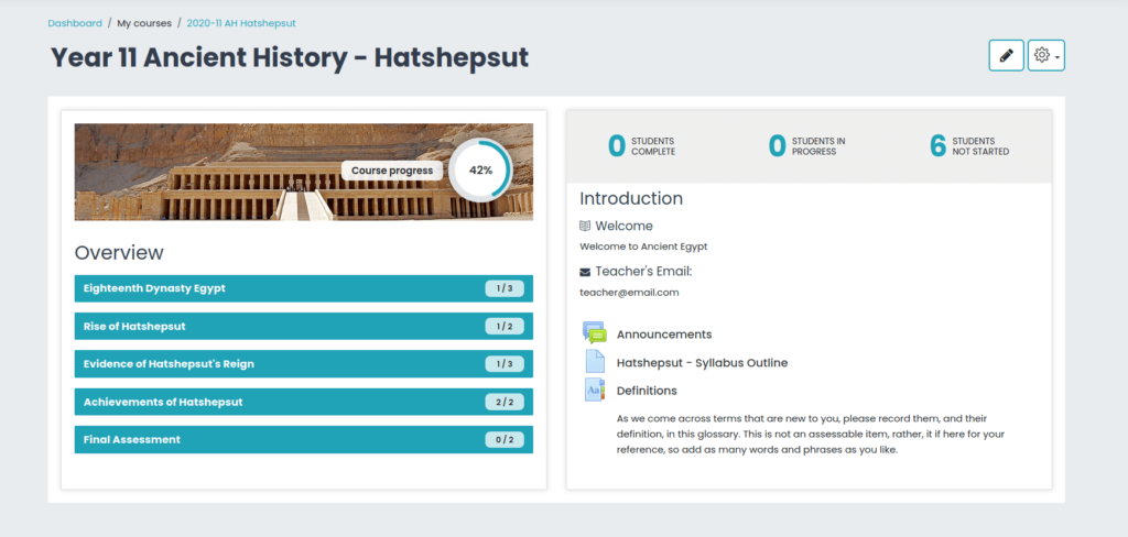
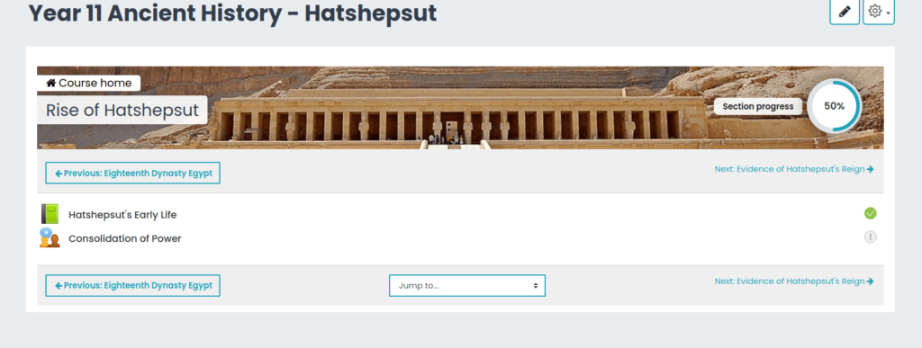
Here is an example of how you can layout a large amount of information well, with Moodle’s two column course format.
Lack of responsiveness
Generally, students have access to a wide range of devices. In an age of tablets and smart phones, not everyone is viewing their course on a large screen. Take time to make sure that your course functions and looks good, no matter what device it’s being viewed on.
Consumes too much data
Increasingly, students access content on the go, taking advantage of free time to learn when it’s convenient to them. This generally means they have less mobile data available to them, than when they’re on campus or at home. Make sure that your course content doesn’t chew up too much data.
How Moodle can help
Course formats
Sites that are simple, uncluttered and easy to use are those that we find the most accessible. Moodle has a variety of course formats that help with the design of a simpler and ultimately more engaging course for your students.
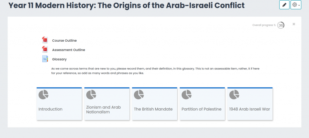
The course formats that Moodle offers supports each individual topic appearing on it’s own page. These formats provide easy movement between topics and allow students to focus on one topic at a time, rather than worrying about the sea of content that’s ahead of them.
Course settings
In addition to course formats, using Moodle course settings such as stealth activities and activity restrictions allows for course layouts to appear simple to students, even though they still include larger numbers of activities and resources. Using these options helps you manage what students see and when, controlling the flow of learning, as required.
Improve student engagement for your online courses
Remember, creating course formats that are more than a list of items thrown together helps make your course more accessible to students. It conveys the message that your course and it’s content is up to date and well-designed, with the student in mind.
Spend some time looking at possible course formats and playing around with layouts and content structure. Your course will go from a sea of text to a much more interesting and captivating learning journey.
E-learning Consulting with Catalyst IT
Looking for extra support your online courses?
Leverage the expert knowledge of our e-Learning consultants. We can help create a course that works for you and your students to achieve great learning outcomes.